The Evidence
Data Sources:
CO2 variations:
Etheridge et al, 1996
MacFarling Meure et al. 2006
Scripps CO2 Program
Global temperature:
IPCC AR6 report
UK Met Office Hadley Centre
US NASA Goddard Institute
US NOAA Centres for Environmental Information
There is so much evidence of climate change that a scientific analysis does not seem needed. However, since there is a solid explanation, then The Science Of Climate Change is set out below.
 The basic tool that has laid the foundation, is the examination of ice cores from the Arctic.
 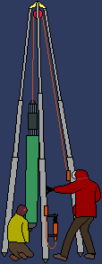 As new snow falls on settled snow, the weight compresses the settled snow, which becomes ice. This ice traps air bubbles which contain air from the time the snow became ice. As this builds up, this creates a record of the atmosphere over hundreds of thousands of years. The content of the air varies with temperature, so we then have records of temperature and air contents going back over millenia.
Drilling is reasonably straightforward, even if sometimes done in difficult weather. A rotating metal tube is pushed down into the ice and as it cuts a core of ice is left inside the drill. This then breaks off and is carefully labelled and stored.
To get the cores required to give the data for a long time period, therefore, requires many cycles of preparing drill, lowering it, cutting, raising, removing the drilled core, and accurately labelling. Not to mention placing the drill precisely over the centre of the previous hole for the next cycle.
There is a lot of information about drilling ice cores here.
Examining the data
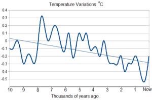
1 Looking at the data from the ice cores, we find that in the Holocene period, the last 10,000 years, which is since the last ice age, the average temperature of planet Earth has not until recently varied from its average by more than one degree. This has given us the stability to develop a civilisation, and even then it has been two steps forward and one back. The trend line, which shows where a slightly jumpy line is heading, shows that the temperature was steadily declining. We were on the way to another ice age in a few tens of thousands of years:
2 But if we examine the data in more detail from 1880 onwards, since the start of the industrial revolution, a new picture emerges:
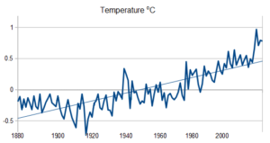
The decreasing temperature stopped falling and has started rising. The up-axis on the two graphs are different, the second graph shows a much steeper increase than the decrease of the first graph. This, sadly, demonstrates that the temperature trend of the planet has undergone a significant reversal of what was previously happening, and the change has taken us out of the Goldilocks zone. The Goldilocks zone is a scientific joke – it means “not too hot” (Pappa Bear’s porridge) and “not too cold” (Mamma Bear’s porridge).
The question is “Why the change?”.
3 The answer comes from our atmosphere. Earth’s atmosphere is about 78% nitrogen, 20% oxygen, 1% argon and 1% other gasses such as carbon dioxide (only 1/25 of the 1%). Air also contains a variable amount of water vapour. Some of the gasses in the atmosphere, like carbon dioxide, have the effect of trapping the heat from the Sun, as shown below:

These gasses keep our planet warm and have enabled living creatures to flourish. It is just like a greenhouse, and so these gasses are called “greenhouse gasses”. What we need is the right balance so that the planet is kept warm, but not too warm, or else weather conditions would make our current way of life unsustainable. Balance is a universal principle.
There are a number of greenhouse gasses, but the most persist is carbon dioxide (CO2 in scientific notation). If we examine the data from the ice cores and look at the temperature and the CO2 levels over the last 800,000 years, then we see:
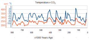
The blue axis and line are temperature (oC) and the orange axis and line are CO2 level (ppmv) (parts per million by volume). This shows that as the CO2 level changes, so does the temperature. The CO2 changes first and ever so slightly later the temperature changes.
4 Looking now at extra detail of this from satellite readings since 2003:
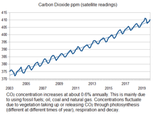
5 Leading to the inevitable conclusion that CO2 levels are rising, and knowing that CO2 and temperature stay in step, the temperature is too.
This shows that the planet is warming. One degree may not sound much, but over the w hole planet it amounts to a lot. It is a colossal amount of energy.
The next stage is to model the situation and determine what the probable effects are. The world models that are used, split the world up into squares, 100km on a side (medium resolution) or 10km on a side (fine resolution).
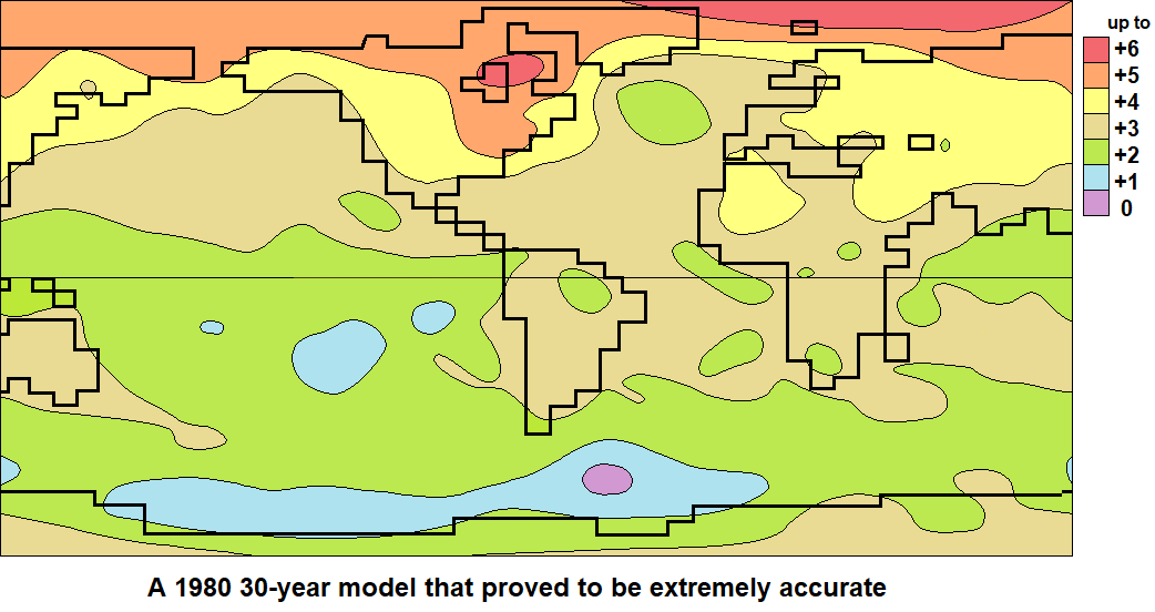
Scientists are careful not to put too much trust in theoretical predictions, but if you get rainfall of 1,000 litres followed by rainfall of 2,000 litres then calculating the total rainfall can be done quite accurately. Some of the quantities are not so easy to calculate, but by calibrating the model against experience, the current models show themselves to be surprisingly accurate.
If you would like to make a simple model yourself on a spreadsheet, the instructions are here.
The full sized models that are used produce output like this:
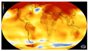
Click here to see the NASA global warming model.
The effect of global warming:
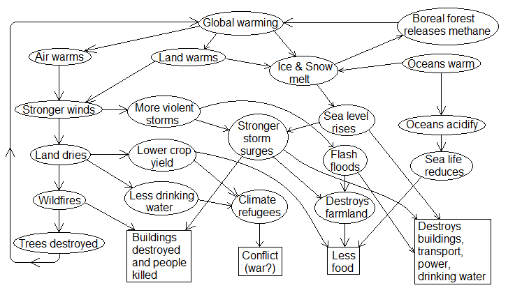
As general air temperature rises, the warmer air can hold more water and so it takes up more moisture from the oceans it passes over and dries the land it passes over also.
This causes:
1 Heatwaves,
2 Drought or water shortage in some areas,
3 Wild fires after land dries out,
4 Severe storms when the extra moisture falls,
5 Floods, flash floods and sea surges – city water systems can’t cope and salt water wrecks farmland,
6 Acidic oceans – the air warms the sea which is already acid because of the CO2 so that the water dissolves more CO2 making oceans more acidic. The more acidic sea damages the creatures which have adjusted to the old level of acidity.
There are also some tipping points caused by feedback. For example:
- The Northern permafrost is melting > releasing methane (a potent greenhouse gas) > causing further warming > accelerating the melting of more permafrost.
- Forest fires > fewer trees > less CO2 absorbed > more warming > more fires.
- Melting ice sheet > less bright surface > more light energy absorbed > more ice melts.
- Ocean warming > fewer clouds > less sunshine reflected back into space > more atmospheric warming > more ocean warming : (Earth has become 0.5 of 1 per cent less reflective since 2017).
- Ocean warming > greatly increased urchin reproduction > reduced kelp forests > less carbon fixation > less absorption of carbon from the air > increased temperature > increased ocean warming.
There is a lot about the oceans, they do cover two thirds of the planet, linked here.
So when discussing, remember the steps:
1 Ten thousand years of stable temperature
2 150 years of increase, since the start of the industrial revolution, taking us above stability
3 Carbon dioxide and temperature stay in step
4 Carbon dioxide dramatically increased since 1900
5 So we have global warming and climate change
What do we do about it?
1 stop adding more greenhouse gasses, and
2 remove as much of the excess as we can.
We can stop adding by not burning fossil fuels and
We can remove much of the excess by planting trees, which is the purpose of this organisation!
The Chemistry
The burning of fossil fuels has the following chemistry:
Fuel (any hydrocarbon source) plus Oxygen gives Carbon Dioxide and Water and Energy
For example, for methane:
CH4 + 2 O2 -> CO2 + 2 H2O + energy
(CH4 = methane, burning in O2 = oxygen, gives CO2 = carbon dioxide plus H2O = water + energy)
Natural gas is the cleanest burning fossil fuel. Coal and oil, the other fossil fuels, are more chemically complicated than natural gas, and when burnt, release a number of harmful air pollutants. Burning methane releases only carbon dioxide and water. Natural gas is mostly methane. Petrol and diesel come from oil. Nuclear power produces some of the worst pollutants on the planet.
Other theories about global warming that have now been dismissed include:
1 Sunspot activity sending out more heat is causing the warming.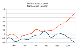
We can measure the energy being radiated towards us, and by a similar method to ice cores we can analyse the pattern over time. This graph shows the amount of sunlight energy hitting the planet and the planet’s average temperature. The left half of the graph shows that there is a strong, positive correlation between irradiance and temperature. The right half shows a strong negative correlation between irradiance and temperature. The overall correlation is therefore zero, indicating that irradiance change does not cause significant global warming.
2 Volcanoes adding hot gases to our atmosphere might be responsible for the warming.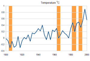
This graph shows the temperature from 1900 to 2000. The vertical orange bars show the times of the four major volcanic eruptions of the 20th Century and the interruptions in the long term warming trend. As can be seen, the interruptions were short-term, indicating that eruptions are not significant contributors to global warming.
You can read our Biodiversity page here.
You can read our Soil & Trees page here.